montclair state university
our objectives for montclair state university’s campaign were, let’s just say, layered. not only did we aim to develop an anthemic brand concept that carried the flexibility to speak both universally and specifically to a spectrum of benefits, we needed to ensure it broke from the category’s clutter of sameness.
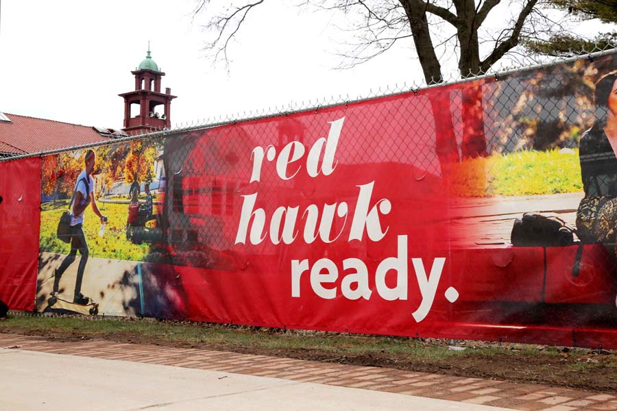
the happy result is a campaign we call “red hawk ready”, which speaks to the many ways in which montclair state readies its students for lifetimes of success. while messaging leverages the university’s momentum in a way that’s distinctively montclair state, the design is next-generation, centering on a modern and sophisticated use of msu's core red color. while other schools in the region have red at their center, we made sure montclair state was the only school to own it.


at its core, the red hawk ready concept is about moments, big and small, that prepare students to reach their goals in education — and in life. the ready spots bring that thinking to life by showing people in the process of readying themselves in ways simple and transformative. each spot creates an anthemic, evocative story that says; at montclair state, getting ready for the new world is a powerful, positive experience — in and of itself."
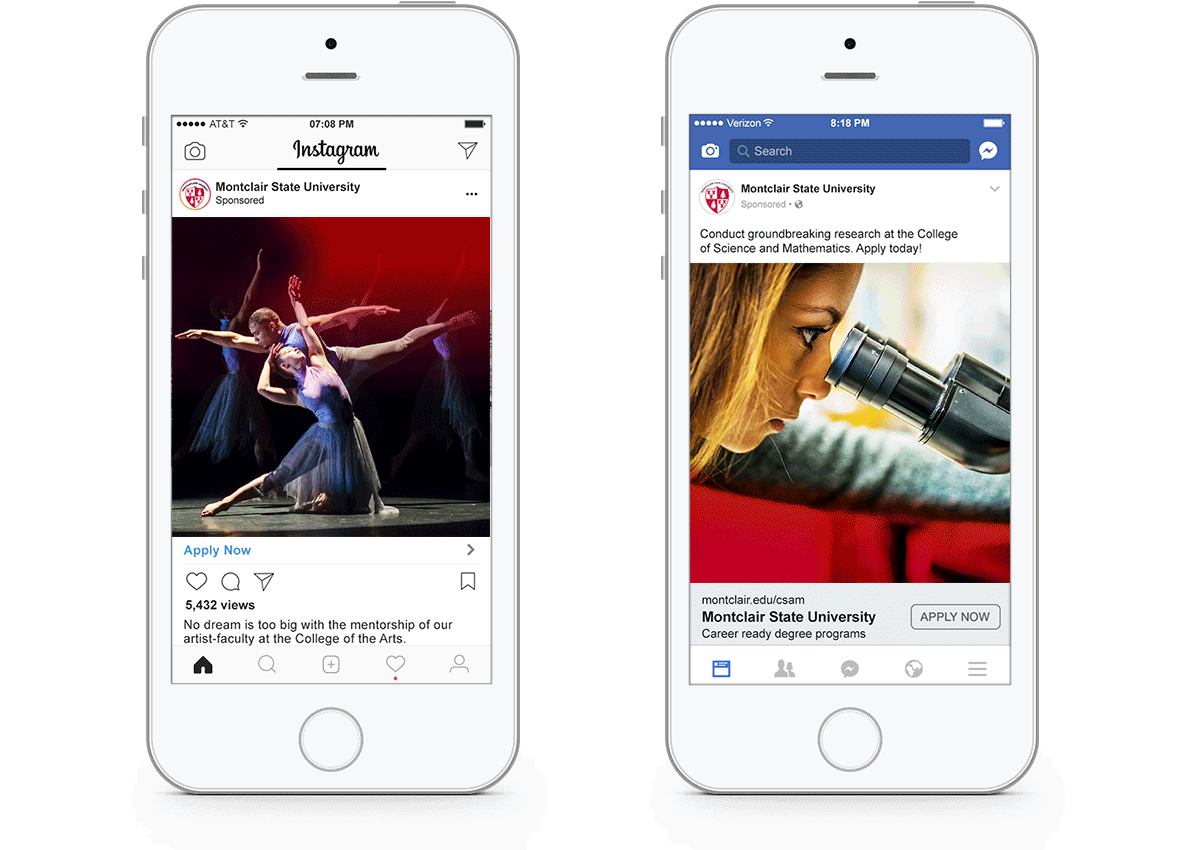
using media that ranges from snap video and ooh to digital and collateral, this campaign uses a multitude of media to showcase a multitude of offerings. the integrated campaign ran on facebook, instagram, and youtube pre-roll — and in the form of digital display, collateral, and infographics. we also created interactive posters for the admissions office, inciting prospective students to take and post selfies with them.