view our featured work. or, view work by:
the watsons

we’re the watsons.
we specialize in advertising, advocating, anxiety-relieving, asking, branding, challenging, cost-saving, designing, digging, listening, pivoting, & supporting.
we’re fond of small type, big pours, and dogs of all sizes.

WATSNEW


filter: featured work.

the work.

johns hopkins medicine

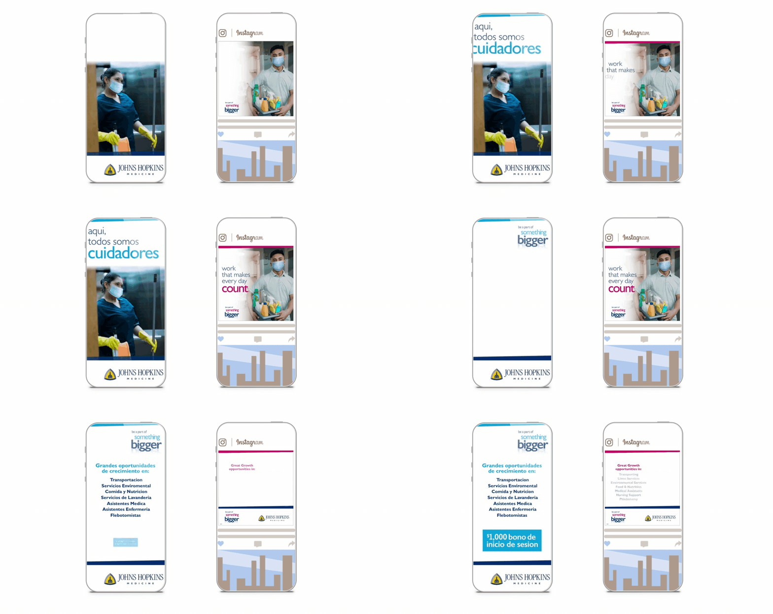
johns hopkins medicine is a place in which extraordinary people do extraordinary things every day. we watsons are honored to have created a new employment branding campaign that brings that very notion to light – and at a time when finding talent takes new thinking.


after onboarding eleven of johns hopkins’ entities, we developed branding campaigns for both nursing and key staff. in doing so, we created a resonant master brand flexible enough to allow for disparate selling points of each entity. 


creating a campaign starts with a tagline.

for positioning, we created a manifesto for both nursing and key staff, specifically transporting, linen services, environmental services, and food & nutrition. not only do the manifestos establish our positioning, they also convey key messaging and tone of voice – and culminates in a new theme line: be a part of something bigger.


the theme line enforces a higher order benefit that supports the familial culture, speaks to the size and structure of the organization leading to greater opportunity, and references working with purpose. this “caregivers one and all” approach for nurses and key staff became a multi-channel strategy that includes digital, social, linkedin, pandora, and a unified landing page.
boston children’s hospital

way back in 2006, we watsons were asked to create a nurse recruitment video for boston children’s hospital. one video turned into two. two, into a series. and a partnership was born. in 2014, we were named recruitment agency of record for this amazing place —and today, we’re blissfully still at it. kids and the people who make them well. how’s that for a client roster?

featured_bostonchidrenshospital_printad_1crop.jpg
featured_bostonchidrenshospital_printad_crop.jpg

a branding campaign for people with purpose.

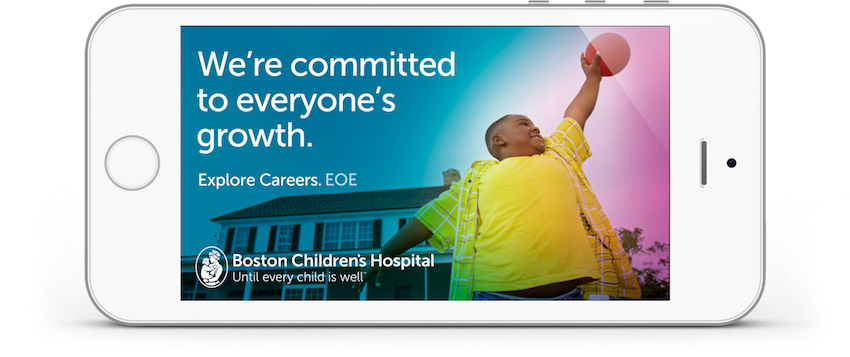
even the world’s best brands have their challenges finding top talent. the key is tapping into those qualities that connect the brand with prospective employees in an emotionally-resonant way. for boston children’s recruitment branding and advertising, we took a detour from the “people at work” imagery ubiquitous to the category and put the focus on a shared purpose — kids. 

leveraging design elements of the consumer master brand, our campaign used evocative imagery of children in heartfelt moments. we created headlines that tap into the optimism of the brand, highlighting the many ways a career at boston children’s changes the lives of patients and staff alike. media assets included print, collateral, digital, and a brand new career site.

digital_bostonchildrenshospital_iphone_everyonegrowth-850.jpg
featured_bostonchildrenshospital_website.jpg

a very personal website — this one’s for the kids.

their abounding accolades aside, if you want to know how special boston children’s is, you only have to walk its hallways — because that’s where you’ll find their people. the question was, how do we show prospective employees the rarity of its culture? and the passion and diversity of its teams? 

the answer? a new careers site that lets boston children’s people do the talking. we interviewed and photographed employee ambassadors, asking them to post about their jobs across social media. in doing so, we gave job seekers the opportunity to follow actual employees and gain unprecedented access to their daily experiences. you’ll see them at work, get to know their colleagues, their passions, their inspirations, and who they are outside of the hospital. 

thanks to the contributions of some of their incredible talent, people were given a very real sense of boston children’s — from the comforts of their computers. a visit to the career site created an insight into the people, culture, and careers that make boston children’s the best of the best.

nurses, families and patients — brought to you by video.

as mentioned, our very first project for boston children’s was a nurse recruitment video that encapsulated the brand’s people, science, and unfettered caring. to come close to conveying the power of nurse-family-patient relationships, we interviewed all three (patient’s ages permitting), editing together their stories — from their unique points of view. the video was so successful, it was expanded into a series and used for multiple purposes beyond nurse recruiting. the videos also took the top prize at the telly awards.

montclair state university

one of the happiest highlights of our 15 years of watsondom was being named agency of record for montclair state university. if we had a nickel for every time we left the campus saying, ‘i wish i could go here’ we’d need to ask a math major to help us calculate our wealth. this potently productive partnership makes us proud to be red hawks — even if it is in spirit only.

featured_montclairstateuniversity_brochurecover.jpg

montclair state’s new campaign is very much ready.

what began as a normal school in 1908, preparing a handful of students to become teachers, is today a nationally-ranked, research doctoral institution — with more than 21,000 diverse students and over 300 majors, minors, concentrations, and certificate programs. 

as a university experiencing unprecedented growth and recognition, it was time to illuminate their place of leadership in the enrollment marketplace. 

our goal was to develop an anthemic brand concept with the flexibility to speak both universally and specifically to a spectrum of benefits. we also aimed to create a campaign that broke from the category’s clutter of sameness. 

the result is a campaign we call ‘red hawk ready’, which speaks to the many ways in which montclair state readies its students for lifetimes of success. 

the messaging leverages the university’s momentum in a way that’s distinctively montclair state: no other brand can say this or look like this. we also created a next-generation design that centers on a modern and sophisticated use of msu’s core red color — with typography that reflects the dynamic and progressive nature of the school itself. and while there are other schools in the region whose colors include red, we made sure montclair state was the only school to own it.

featured_montclairstateuniversity_brochurespread.jpg

a spot-on approach for generation z.

at its core, the red hawk ready concept is about moments, big and small, that prepare students reach their goals in education — and in life. the ready video spots serve to bring that thinking to life by way of a spectrum of moments that show people in the process of readying themselves in ways as simple as walking to class, opening a book, or starting the day with a run — and as transformative as taking the stage to give a speech and entering an elevator to begin a first internship. each spot creates an anthemic, evocative story that says, at montclair state, getting ready for the new world is a powerful, positive experience — in and of itself. spots were created for undergrad, grad, and csam, the innovative school of communications and media.

adv_montclairstateuniversity_outdoor_br.jpg
featured_montclairstateuniversity_social_advertising_facebook_instagram-850.gif

taking the campaign to integration nation.

using media that ranges from snap ads and ooh to digital and collateral, this campaign uses a multitude of media to showcase a multitude of offerings. the integrated campaign is running on facebook, instagram, and youtube pre-roll — and in the form of digital display, collateral, and infographics. we also created interactive posters for the admissions office, inciting prospective students to take and post selfies with them.