
tampons. liners. and pads. oh my! and get this, they’re organic, biodegradable, and healthy for girls, their moms, and mother earth. our job? brand them and let the goodness flow!

branding a top notch mission-driven brand.
founded in 2018, the organic project (top) was created by two wily business exec-moms who came up empty-handed after searching for healthy, organic period products for their daughters. we watsons were asked to develop a shiny new rebrand that brings their story to light.
out of the gate, we developed brand vision and mission statements, laying the groundwork for messaging in both content and tone. rather than a standard positioning statement, we wrote a consumer-facing “womanifesto” that builds an evocative, humorous bridge between the brand and those it benefits. as we executed assets for each touchpoint — from packaging to point of sale, social to swag — our work culminated with a comprehensive brand guidelines book.
joy in a newly-designed box.
we then designed new packaging for all product SKUs, including tampons, pads, liners, sample packs, first period gift boxes, and new mom gift boxes. the updated brand aesthetic consists of soft, unexpected colors combined with a retro-mod, friendly serif that brings to mind women’s magazines of the 1970s.


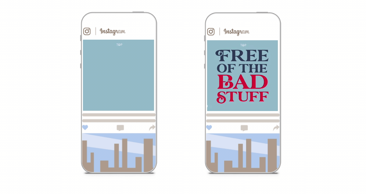
a loud and proud digital campaign
using animated banners, short-form social animations, and sem, we put together a forward-thinking, insight-driven campaign that empowers girls through honest, often humorous messaging. we also built canva templates to give the client easy access to customizable, brand-compliant assets for social.
our design incorporates ultra-modern, 70s-inspired typography that brings bold confidence with a pinch of whimsy to every message. a clean palette of light blues with a textural background give a nod to the organic cotton and plant-based applicators that define the brand – and the messaging mirrors its environment with bold, playful, and unexpected brand promises.